Place: Porcia (PN), via Pontebbana (stretch named after Lino Zanussi)
Author: Gino Valle
Chronology: 1957 | 1961
Itinerary: An hard-working country
Use: Offices and administration

Not easily classifiable within Italian research of the immediate post-war period, Gino Valle began his training at the IUAV, then studied at Harvard with Walter Gropius. As soon as he graduated, he began a deep and lasting friendship with Joseph Ryckwert, who would publish many of his works in foreign magazines. Far from turning him into a coldly cosmopolitan figure, these experiences made him capable of declining this Anglo-Saxon influence in an Italian way. His approach does not lack sensitivity to the theme of the relationship with the context, and, at the same time, brings about innovative solutions for new architectural types linked to the country’s rapid industrial development. In Porcia, the architect was called to deal with this second theme, when he created a new office structure for the Zanussi industries in 1961.

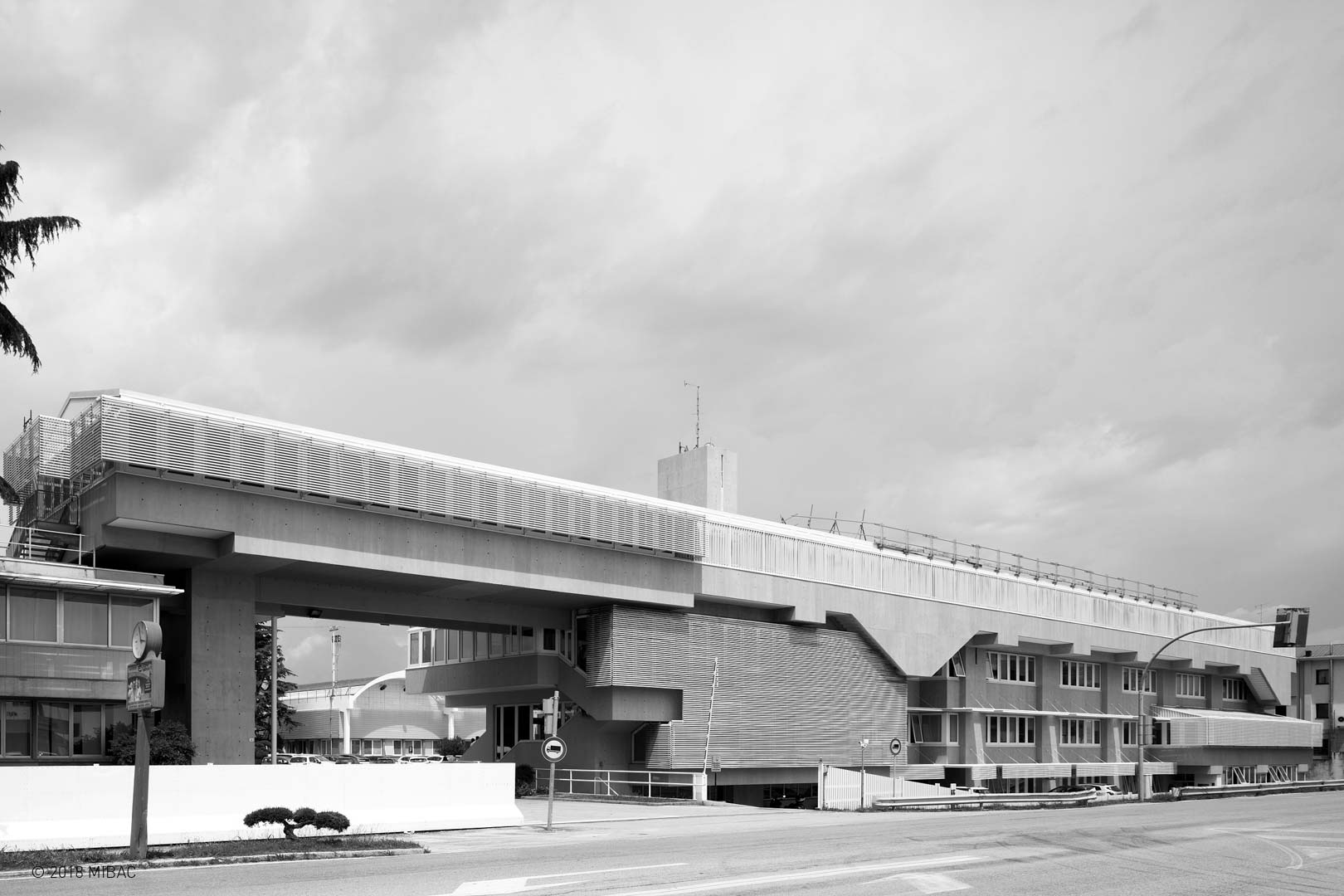
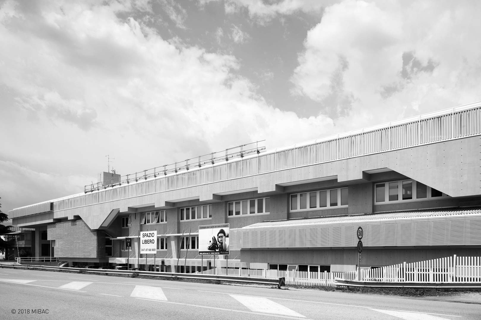
The building, in exposed concrete, closes the southern edge of the plant and follows the course of via Pontebbana, which connects Pordenone with Venice. This architecture, both rigorous and dynamic, was chosen by Carlo Melograni for the cover of his book Architetture nell’Italia della Ricostruzione. Modernità versus modernizzazione 1945-1960, published in 2015.


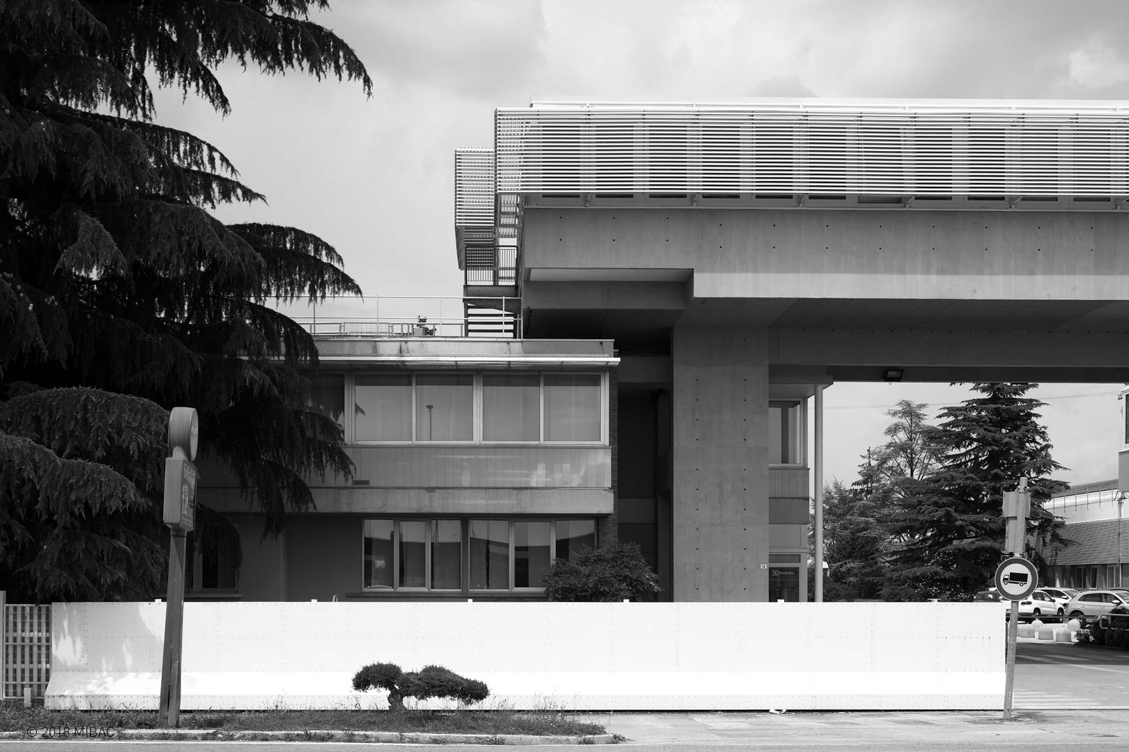
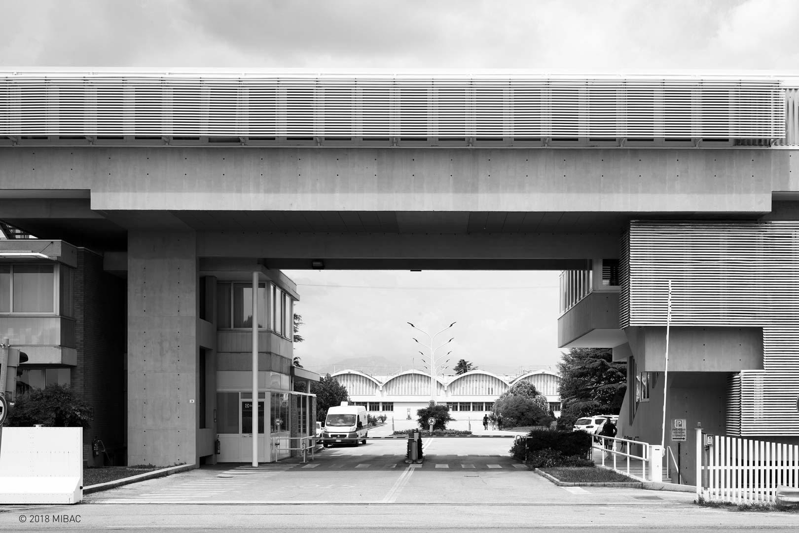
The western end of the long building expands in a wide opening, surmounted only by the continuation of the last level of offices. All the traffic directed to the plants as well as employees, and heavy vehicles transited under this extended passage. Today, this entry has been downgraded, being reserved only to employees. The north building section is articulated in sloping glass terraces that allow light to fall from above. In this way the building, which looks like a clear edge outside, becomes a permeable diaphragm inside.

The last level of the building extends, projecting its shadow onto the floors below and providing natural shielding for the south façade. The imposing heads of the beams are left exposed to mark the rhythm and size of the façade. The layout, otherwise dry and horizontal, is made more complex thanks to the staircases’ projection on the façade, which deform the continuous line of the rooftop.

The ground connection of the building is also carefully designed, thanks to the presence of a moat that lowers the altitude to just below street level; the employees’ parking spaces are there, barely visible from the outside, not interfering with the perception of the architecture behind it. The moat also has the task of physically detaching the building from the roadway.

